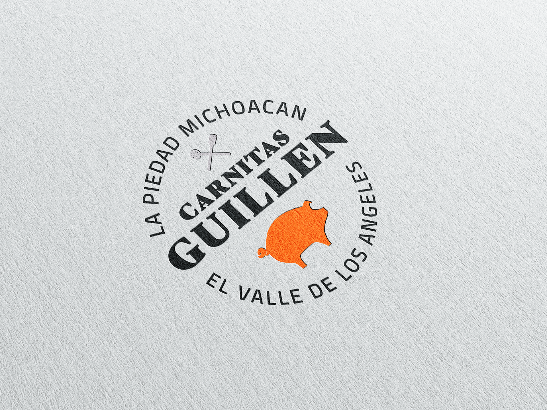
a family-founded + operated business functioning from their humble home in the valley of los angeles, requested me to design their logo based on influences from their motherland: la piedad, michoacán in mexico. after doing careful research, i decided to focus on the identity of the monarcas - the monarch butterflies which migrate in huge numbers between the oyamel fir tree forests in the state of michoacán to the united states throughout the year. these butterflies also carry great significance to the people who have migrated up north to the u.s.
the bright, uplifting colors of the logo were pulled directly from the monarch butterfly markings. as for the typography, i chose to resemble the look and feel of a mexican-owned carniceria we typically see in the los angeles area. lastly, i had to include the unique tools needed to create the mouth-watering carnitas meat that the guillen family cook and sell.
if you find yourself craving carnitas, i recommend reaching the familia guillen on their instagram profile.

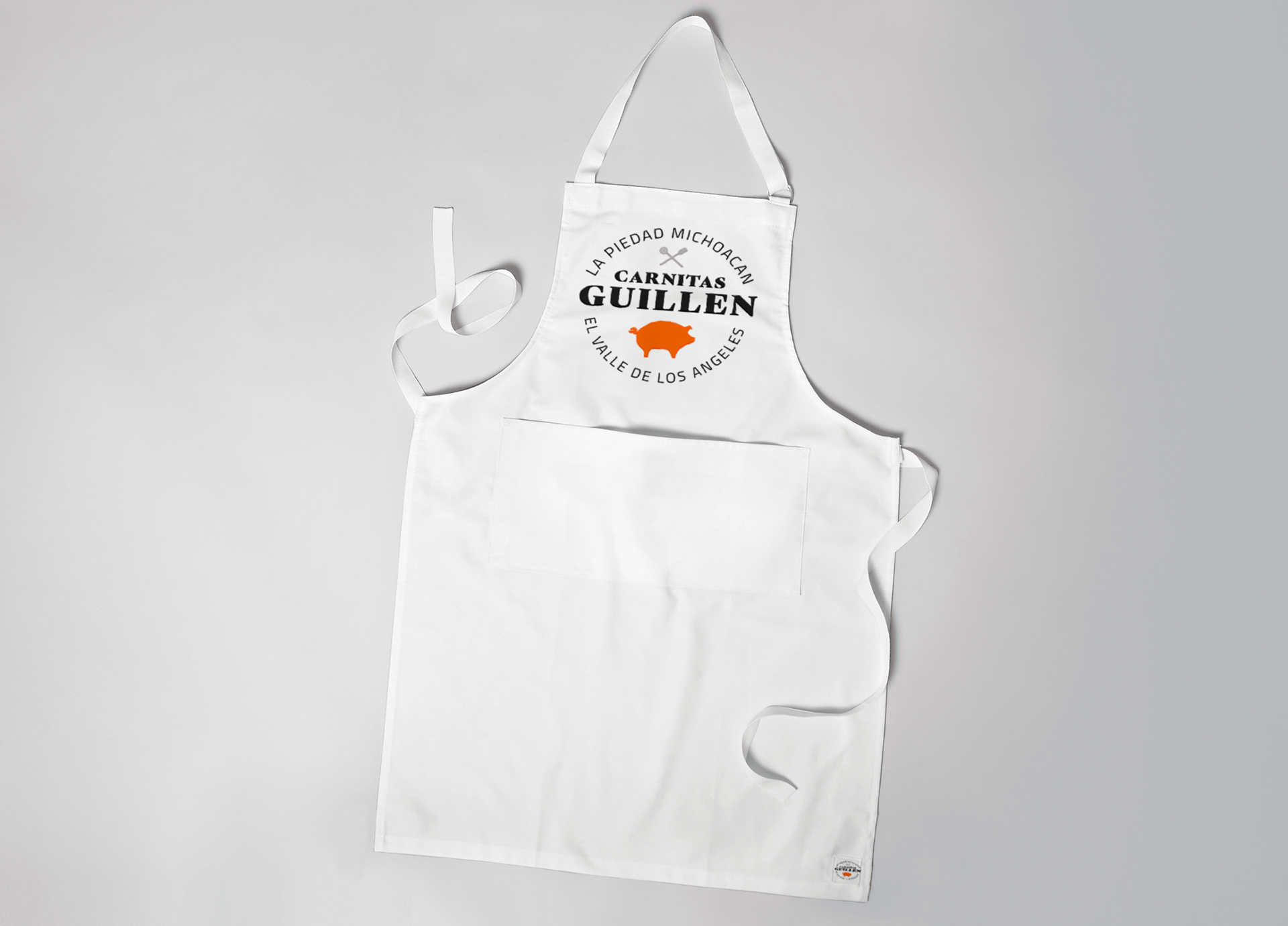
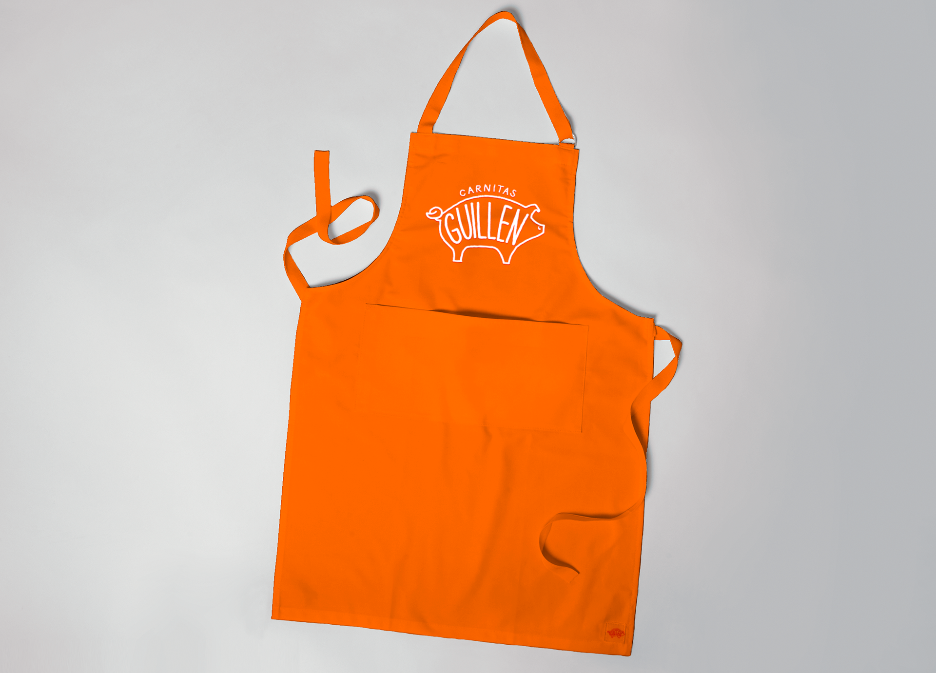
in addition to having a formal logo, the guillen family asked me to create a design that could be used for supplemental items such as coasters and an apron that their daughters and nephew could use. i went ahead and extended the design of the formal logo above by utilizing the iconic piggy and the bright orange. i also included hand-written text to give the design a touch of fun and youthfulness while still helping their company name stand out.